Connect · Frames per picture
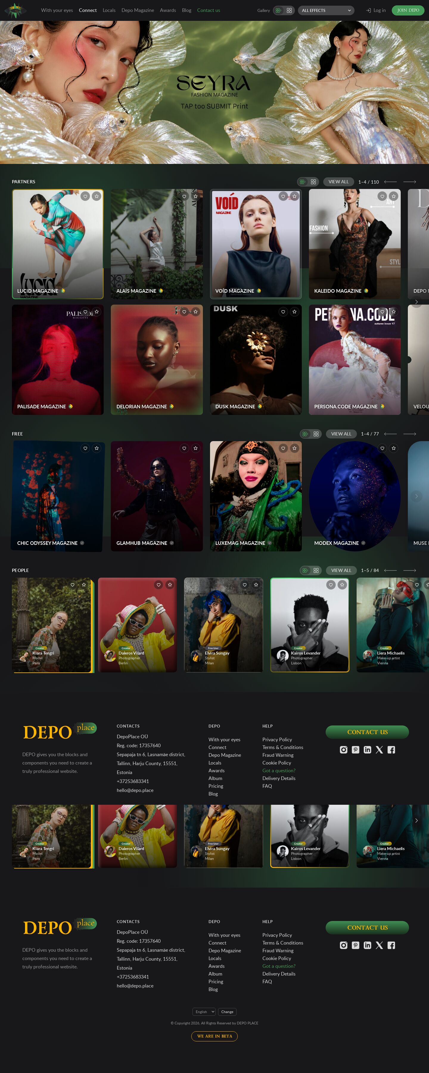
demo46's Connect page where every picture wears a frame or effect of its own — 100 numbered styles — with Like and Favourite in each corner and its style number after a 3 s hold; a Gallery block in the menu sets rows or grid (same card size) and all, none or one effect.
Summary
A style sampler built on demo46's Connect page: same banner, same two partner rows that fit the screen, same rows / grid switch — but every single picture has its own frame or effect, so 100 treatments can be judged side by side on real covers and portraits. Holding the pointer on a picture for three seconds shows its style number in the top-left corner; "use 2, 8 and 23" is enough to choose. Each picture also carries Like and Favourite buttons in its top-right corner.
Prompt
The brief this page was built from.
Rebuild the DEPO Connect page (https://dev0.dphub.net/connect; front/templates/connect/ and
front/public/css/modules/Publish.css) as a demo page with the live header, footer and green
animated background, and keep its measures: the page banner edge to edge under the header (8:3,
at most 480 px, the live slides fading), then PARTNERS, FREE and People. Each section head is
the site's: a small uppercase title on the left; on the right a two-icon view switch, the grey
"VIEW ALL" pill, the position ("1–4 / 110") and the site's long arrows. No extra headings,
ledes or explanations.

- View switch: rows (horizontal scroll) or grid (cards wrap, the page scrolls). One switch for
  the whole page: the icons in every head change all three blocks at once; the choice is
  remembered in the browser (and ?view=grid opens the grid).
- Rows: PARTNERS in two rows that scroll together sideways; FREE in one row; People in one row,
  the same cards as the magazines, a little smaller (no panel or box around them). The wheel over a row scrolls that row and hands back to the
  page at its ends; mouse drag; keyboard; quiet semi-transparent edge zones inside the row.
- Size: the site's 1 : 1.2 cards with 10 px corners, a little smaller than live. The card height
  comes from the screen height, so that the header, the section head and both partner rows fit
  on one screen with at least 10 px left under them; on short or narrow screens the cards shrink
  (on phones at least two side by side).
- Content: at least as many cards as demo42 — every partner issue (220, interleaved so that
  neighbours are different magazines), 77 free magazines, 84 people — from the shared
  js/connect-data.js; captions "<NAME> MAGAZINE" with the site's paid / free badges; people with
  avatar, badge, name, profession and city.

Per picture, not per block: give every image its own frame or effect from a numbered set of
100 (borders, mounts, glows, overlays, filters, shapes, hover motions), dealt out so neighbours
differ; ?fx=<n> shows the whole page in one style. Top-right of each picture: Like and
Favourite (toggles, remembered in the browser). Top-left: after holding the pointer on a
picture for 3 s (a ring fills meanwhile), a circle with that picture's style number.
Look
- Type: Lato (captions, pills, position), the site chrome's Poppins and Lazurski — all from the live site, self-hosted in public/demo49/fonts/.
- Palette: page #18171a with the green background; text #fff, secondary rgb(255 255 255 / 0.7); pills rgb(255 255 255 / 0.2); accent #469a58 (the pressed view icon, hover).
- Layout: header (70 px, sticky) · banner (8:3, ≤ 480 px) · PARTNERS (head 44 px, two rows) · FREE (one row) · People (one row, cards at 86 %) · footer. Card height = (100svh − header − 14 px − head − 18 px row gap − 14 px) / 2, between 120 and 440 px, and at most 44vw × 1.2 on phones; width = height / 1.2; gaps 24 px (the site: 40 px). Grid view: the same card width and gaps as the rows (as many columns as fit), so switching never changes the card size.
- Cards: as the site's Publish_item: picture with 10 px corners, a gradient shade (35 % → 75 % black), caption bottom-left in Lato 600 uppercase with the paid / free badge; people the same card at 86 % with a 40 px avatar, badge, name, profession and city.
- Motion: the banner fades every 6 s; the picture zooms 3 % on hover; rails glide (rail.js).
The 100 styles
Dealt out as style ((k × 7) mod 100) + 1 for the k-th card, so the two partner rows and neighbours never repeat a style. The Gallery block in the site menu (before Log in; in the burger panel on small screens) sets the layout — rows or grid, the same switch as in every section head — and the effects: All effects (every picture its own), No effects, or one of the 100 for every picture; the choice is remembered, ?fx=<n> / ?fx=off open with it. The rules are at the bottom of public/demo49/css/demo49.css (.fx-1 … .fx-100).
| No. | Style |
|---|---|
| 1 | Hairline — a thin white line inside the edge |
| 2 | Gilded — gold gradient band, dark inner hair, warm glow; the gold turns on hover |
| 3 | Matted — dark passe-partout with a silver hairline round the picture |
| 4 | DEPO ring — green gradient band |
| 5 | Double line — two white lines with a gap |
| 6 | Offset block — a green block shadow down-right |
| 7 | Neon — green line and glow |
| 8 | Turning border — DEPO green / yellow sweep runs round the edge |
| 9 | Corner brackets — yellow L-marks in two corners |
| 10 | Black & white → colour on hover |
| 11 | Green duotone |
| 12 | Warm sepia with a vignette |
| 13 | Deep vignette |
| 14 | Film grain |
| 15 | Scanlines |
| 16 | Sheen — a light band crosses on hover |
| 17 | Glass — a reflection over the top-left |
| 18 | Bevel — raised edge, light top-left, dark bottom-right |
| 19 | Chromatic — red / cyan fringes |
| 20 | Halftone dots |
| 21 | Slow zoom — Ken Burns on hover |
| 22 | Tilt — leans back in 3D on hover |
| 23 | Cut corners — two corners clipped off |
| 24 | Soft round — big corners and a deep soft shadow |
| 25 | Arch — round top |
| 26 | Dashed yellow outline at a distance |
| 27 | Stack — two sheets peeking behind |
| 28 | Sunrise band — yellow → green gradient border |
| 29 | Inner glow — green light from the edge |
| 30 | Colour pop — rich saturation and contrast |
| 31 | Soft edges — the picture melts into the page |
| 32 | Drawn line — a white line draws itself round the picture on hover |
| 33 | Pulse — a green glow breathes on hover |
| 34 | Glow bar — a light bar along the bottom edge |
| 35 | Cinema — letterbox bars |
| 36 | Frosted mount — a frosted-glass band of the picture's own colours |
| 37 | White mount — a wide white border |
| 38 | Black mount — a wide black border with a hair of grey |
| 39 | Yellow hairline |
| 40 | Green dashed line inside |
| 41 | Dotted white line inside |
| 42 | Gold double line |
| 43 | Dark edges — a deep inner shadow |
| 44 | Long shadow — a stepped diagonal shadow |
| 45 | Float — rises on hover with a shadow under it |
| 46 | Lifted — a soft shadow lifts it off the page |
| 47 | Lean left — turned a little |
| 48 | Lean right |
| 49 | Wobble — rocks once on hover |
| 50 | Zoom out — starts close, steps back on hover |
| 51 | Pan — the picture slides up on hover |
| 52 | Focus pull — blurred, sharp on hover |
| 53 | Dimmed — dark until pointed at |
| 54 | Hue shift on hover |
| 55 | Cool blue tint |
| 56 | Golden hour — warm light |
| 57 | Pink haze |
| 58 | Teal & purple wash |
| 59 | Red monochrome |
| 60 | Hard black & white |
| 61 | Faded matte |
| 62 | Cross process |
| 63 | Lomo — saturated with dark corners |
| 64 | Light leak — warm flare in a corner |
| 65 | Bokeh — soft out-of-focus lights |
| 66 | Pinstripes — fine diagonal lines |
| 67 | Thirds — rule-of-thirds guides |
| 68 | Viewfinder — four corner marks and a centre cross |
| 69 | Oval |
| 70 | Hexagon |
| 71 | Ticket — round notches in both sides |
| 72 | Zigzag — a serrated bottom edge |
| 73 | Chamfer — all four corners cut |
| 74 | Slant — a leaning parallelogram |
| 75 | Torn — a ragged top edge |
| 76 | Leaf — one big rounded corner |
| 77 | Inner window — a mount with a round-cornered opening |
| 78 | Pink neon |
| 79 | Yellow neon |
| 80 | Rainbow border — the full spectrum turning |
| 81 | Shimmer border — a light runs along a silver band |
| 82 | White halo on hover |
| 83 | Spotlight — a pool of light in the middle |
| 84 | Side shade — dark from the left |
| 85 | Top shade — dark from the top |
| 86 | Green echo — a green shadow up-left |
| 87 | Double echo — yellow and green offsets |
| 88 | Inset line — a white line inside the edge |
| 89 | Breathing line — an inner line that swells on hover |
| 90 | Glass caption — a frosted band behind the caption |
| 91 | Half & half — the left half black and white |
| 92 | Frosted foot — the lower third blurred |
| 93 | Poster — flattened, punchy colour |
| 94 | Emboss — deep light-and-dark relief round the edge |
| 95 | Green rim — a wide translucent green edge |
| 96 | Sway — drifts side to side on hover |
| 97 | Heartbeat — beats on hover |
| 98 | Glitch — jumps and splits colour on hover |
| 99 | Colour cycle — the hues turn on hover |
| 100 | Gold & matte — a gold band round a dark mount |
Built with
| Part | What |
|---|---|
| HTML | public/demo49/index.html — the live header and footer, the banner, three sections with data-rail (partners data-rail-rows="2") |
| CSS | public/demo49/css/demo49.css — page, sizes, view switch, cards; css/rail.css (rail structure); css/site.css, site-chrome.css, header.css, ellipses.css (site copies) |
| JS | public/demo49/js/demo49.js — renders the cards (a link + Like / Favourite buttons + the style badge per card), deals the styles, the 3 s hold, likes / favourites in localStorage, the view switch, the heads' position and arrows, the banner fade (vanilla); js/rail.js — the rail engine (wheel, drag, keys, edge zones); js/connect-data.js — the content; js/ellipses.js, js/header.js |
| Libraries | none |
| Fonts | Lato, Poppins, Lazurski (site chrome), self-hosted |
| Images | public/demo49/img/banner-1…3.jpg (the live /connect banner slides), the site's badges and arrow (front/public/images/users/, images/svg/); covers and portraits from /_img/photos/ (+ crops/) and /_img/site/first-page/ |
Borrowed
- dev0.dphub.net/connect (2026-10-24): the layout and every measure from front/public/css/modules/Publish.css (1 : 1.2 cards with 10 px corners, the shade gradient, the caption type, the VIEW ALL pill, the arrow), the banner proportion from front/public/css/site.css
.page-banner, the three banner slides and the badge / arrow icons from the site. - js/rail.js, css/rail.css, js/connect-data.js: the shared Connect kit of demo36–45; the page itself is demo46.
Config
None (static page). localStorage: depo-connect-view (rows / grid), depo-connect-likes and depo-connect-favs (per card).
Notes
- The copied site footer overflows at 992–1365 px (its 280 px "Contact us" button and fixed columns); demo49.css makes those columns fluid in that range. The live front has the same bug (docs/backlog.md in the repository).
Suits a site for…
What kind of website would this design fit? Agree with a tag by clicking it, or add your own — a tag can be several words.
No tags yet — be the first.
Comments 0
No comments yet — be the first.