Connect · Wide Screens
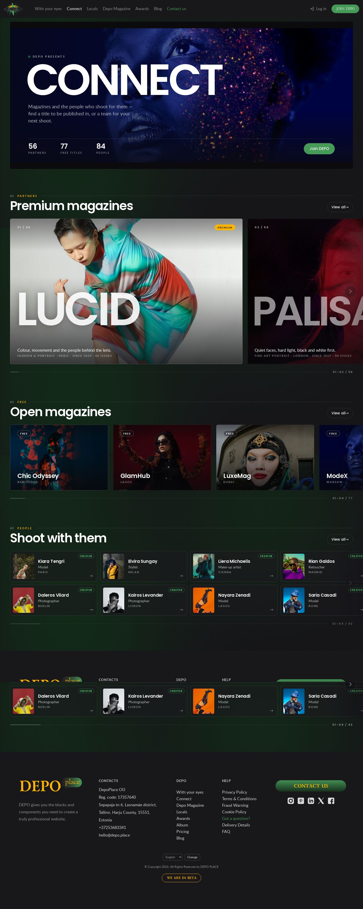
The DEPO Connect page as cinema screens — a letterboxed banner, partners as 16:10 crops with the magazine name set huge across each card, wide FREE cards and a two-row People rail; the wheel scrolls the row under the cursor and the centred card is brighter.
Summary
One of ten presentations of the Connect page (demo36–demo45); this one is horizontal. The banner is a 21:9 letterboxed frame with the title set like a film card. PARTNERS is one row of wide landscape screens — each cover cropped to 16:10 around the face, the magazine name across the card, the line and the credits below; the card nearest the middle of the row is lit, the others dimmed. FREE is one row of medium 3:2 cards, People a two-row rail of compact cards (portrait, name, role, city). With the cursor over a row the wheel moves that row and hands back to the page at its ends; the controls are soft edge zones inside the row and a thin progress line.
Prompt
The brief this page was built from.
Build one page of the DEPO demo album: the DEPO Connect page (dev0.dphub.net/connect — banner,
PARTNERS premium magazines, FREE basic magazines, People) with horizontal rows.

Content: the shared Connect data (js/connect-data.js — 56 partner magazines with genre, city,
year, line, cover and issues; 77 free magazines; 84 people with role, city, photo). Keep the real
DEPO header and footer, the dark #18171a site and the shared animated background. "View all"
links go to dev0.dphub.net/premium, /basic, /locals; cards link to each magazine's page;
Premium / Free / Creator badges as in the data.

Function (shared rail engine js/rail.js + css/rail.css): with the mouse over a row the vertical
wheel scrolls that row (eased), not the page, and at either end of the row the page scrolls
again; mouse drag, keyboard (arrows, Home / End) and native swipe on touch. No big prev / next
buttons above the rows: the controls live inside each row, semi-transparent edge zones with a
chevron (hidden at that end, hidden on touch), plus a thin progress line with "03–06 / 84".

Design: cinematic wide screens. Banner: a 21:9 letterboxed frame (black bars top and bottom),
a slow drift on the photo, the title huge in uppercase, the counts as credits. PARTNERS: one row
of 16:10 crops of the covers, object-position chosen per cover so faces stay in frame, the
magazine name set huge across the card (sized to fit its length), line and credits (genre, city,
year, issue count) at the bottom; the card nearest the middle of the row is full brightness, the
others dimmed. FREE: one row of medium 3:2 cards. People: a two-row rail of compact horizontal
cards (portrait thumbnail, name, role, city, Creator badge). Poppins for display, Lato for text.
Responsive to 375 px without horizontal page scroll; prefers-reduced-motion respected.
Look
- Type: Poppins 600 (banner title, magazine names across the cards, section titles, names), Lato (lines, credits, kickers). Self-hosted from the site kit.
- Palette: #18171a ground with the shared background; #0b0b0d letterbox bars; dimmed covers (brightness .6) against the lit centred one; #ffb500 Premium tag and kickers; #53f57e Creator badge and the "recording" dot; #469a58 Join button.
- Layout: letterboxed banner; three full-bleed rails aligned to the page container (
--rail-pad): partners at min(64vw, 1000px) per card, free at 27vw, people at 24vw in two rows. - Motion: the banner photo drifts (CSS keyframes); the rails glide (rail.js rAF easing); the centred card brightens and its name slides a little (CSS transitions on
.is-active, set by js/demo44.js from the track's scroll). All off withprefers-reduced-motion.
Built with
| Part | What |
|---|---|
| HTML | public/demo44/index.html |
| CSS | public/demo44/css/demo44.css, css/rail.css (shared rail structure) (+ the site kit: site.css, site-chrome.css, header.css, ellipses.css) |
| JS | public/demo44/js/demo44.js — vanilla, renders the cards and marks the centred one; js/rail.js — shared rail engine; js/ellipses.js, js/header.js (kit); /demo20/js/shared.js (shared background) |
| Libraries | none |
| Fonts | self-hosted in public/demo44/fonts/: Lato, Poppins |
| Images | /_img/photos/ (partner covers), /_img/site/first-page/ (banner, free magazines, people) |
Borrowed
Nothing borrowed. The header, footer and background are the album's copy of the DEPO site chrome.
Config
None — static page.
Notes
- 2026-10-23: seven times the content — 56 partners (the original eight, Depo Magazine and 47 more) with 220 issues, 77 free titles, 84 people (js/connect-data.js, the same file in every Connect demo). The album has ~30 covers and 24 portraits, so the new entries reuse them as close-up crops in
/_img/photos/crops/(logos cropped away;mag1–4.jpgare the Depo Magazine covers from front/public/images/depo-magazine/), spread so the same photo never sits next to itself. - rail.css adds
display:block; gap:0; padding:0; overflow:visible; scroll-snap-type:noneto.rail, because site.css has its own.railslider rule that would lay the track, edges and progress bar side by side. - rail.js: at the end of a row the position reads "07–08 / 08" (the last cards) instead of "08–08".
Suits a site for…
What kind of website would this design fit? Agree with a tag by clicking it, or add your own — a tag can be several words.
No tags yet — be the first.
Comments 0
No comments yet — be the first.