Connect · One Rail
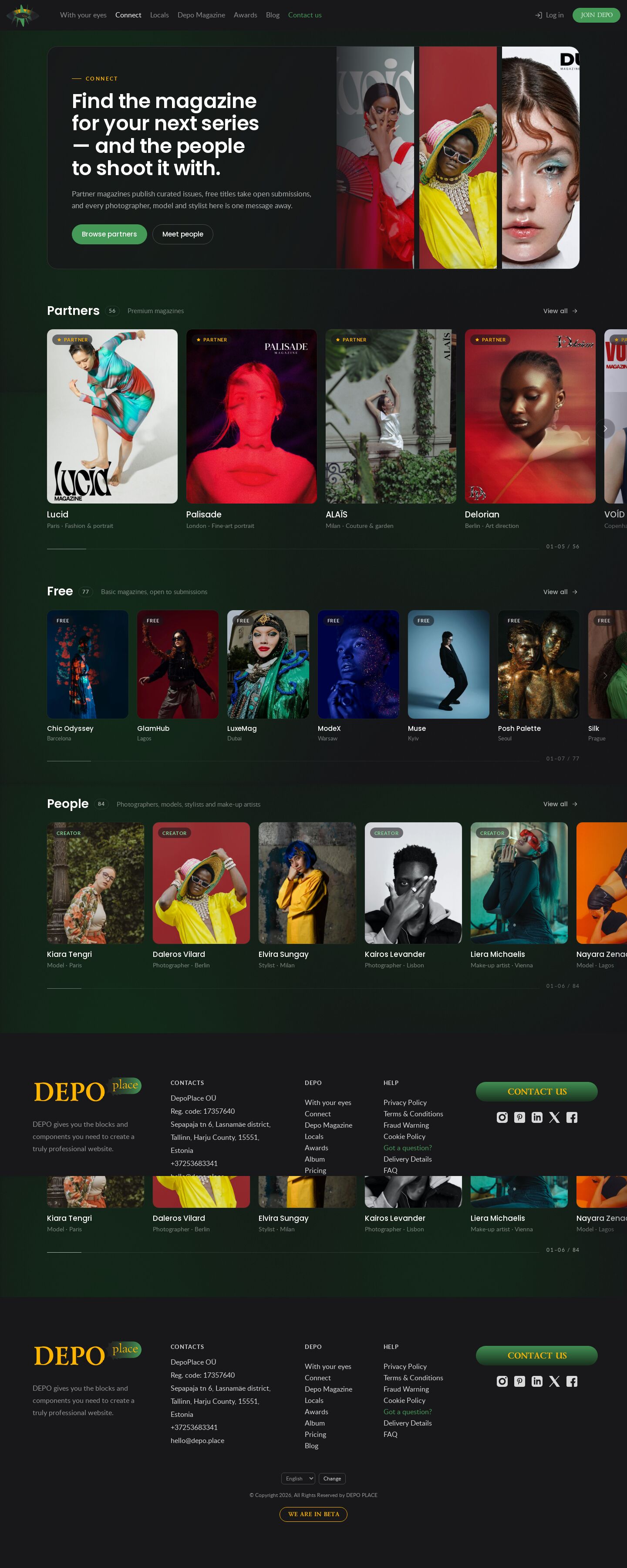
The cleanest, product version of the DEPO Connect page and the reference rail engine — every section is one row (3:4 partner covers, smaller FREE cards, portraits); the wheel scrolls the row under the cursor, with quiet glass edge zones and a thin "03–06 / 56" progress line inside each row.
Summary
The improved version of today's Connect slider, kept deliberately plain so the rail itself is the feature. A glass banner card (headline, lede, two buttons, a strip of three photos) sits above three sections, each with a header — title, a count chip, a subtitle and "View all →" — and exactly one row: PARTNERS as large 3:4 covers about 300 px wide with the magazine name and city · genre underneath, FREE as a row of smaller cards, People as a row of portraits. The rows bleed to the window edge while the first card lines up with the content column. The wheel over a row scrolls that row and hands back to the page at either end; the big separate prev / next buttons of the live site are replaced by soft semi-transparent edge zones with a chevron inside the row, and a thin progress line with "03–06 / 56" sits under the cards.
Prompt
The brief this page was built from.
Build one page of the DEPO demo album: the DEPO Connect page (dev0.dphub.net/connect — page
banner, PARTNERS = premium magazines, FREE = basic magazines, People) as horizontal rows.
Name: "Connect · One Rail". It is the cleanest, most "product" version and the reference for
the shared rail engine.

Content and function:
- The real DEPO site header and footer (Connect active); the shared album background
  (/demo20/js/shared.js) shows through; the page content stays transparent.
- Render the cards from the shared data file js/connect-data.js (56 partners, 77 free magazines,
  84 people). Cards link to their href; "view all" goes to /premium, /basic and /locals on
  dev0.dphub.net; badges as in the data (paid partners, free magazines, paid creators).
- Banner: a rounded glass card with headline, lede, "Browse partners" / "Meet people" buttons
  and three tall photos on the right.
- Every section is one row built on the shared rail engine (js/rail.js + css/rail.css):
  PARTNERS = large portrait covers (3:4, ~300 px wide on desktop) with magazine name and
  city · genre under each and an issue count on hover; FREE = one row of smaller cards;
  People = one row of portraits with name and role · city.
- Section headers: title, a count chip, a subtitle, "View all →".
- Rail behaviour: the mouse wheel over a row scrolls that row (eased), and at either end the
  wheel scrolls the page again; mouse drag; keyboard (← → Home End); semi-transparent edge zones
  with a chevron inside the row, hidden at that end; a thin progress line with "03–06 / 56"
  inside each row. No big separate arrow buttons. Rows bleed to the window edge, the first card
  aligned with the content column.
- Touch: native swipe, edge controls hidden. Responsive to 375 px with no horizontal page
  overflow; reduced motion respected; lazy images with width/height; visible focus.

Design: the DEPO site language made calm and premium — dark ground #18171a, Poppins for titles
and names, Lato for text, 14 px card radius, glass pills for badges, DEPO green buttons, site
yellow for the partner star. Vanilla JS, no libraries.
Look
- Type: Poppins 500–600 (banner headline, section titles, card names, buttons) and Lato (lede, meta, progress numbers, badges) — the site's own self-hosted files.
- Palette:
#18171aground, white text at 100 / 66 / 44 %, hairlines at 10 %,#469a58/#53b167DEPO green (primary button, focus),#ffb500yellow (eyebrow, partner star badge),#7fd893creator badge; glassrgb(24 23 26 / 0.5–0.6)behind chevrons and badges. - Layout: banner card inside a 1320 px column (text | three photos); three sections, each a header row and one full-bleed rail whose inner padding equals the column offset; cards 300 / 196 / 224 px wide on desktop, 68 / 42 / 46 vw on phones.
- Motion: eased rAF glide for wheel, edge clicks and keys (snap off while gliding, proximity snap after); edge zones rest at 35 % opacity and come up on hover; cover zoom 1.04 and the issue pill slide in on hover. Reduced motion: jumps, no transitions.
Built with
| Part | What |
|---|---|
| HTML | public/demo41/index.html |
| CSS | public/demo41/css/demo41.css, css/rail.css (shared rail structure) + the site CSS copies site.css, site-chrome.css, header.css, ellipses.css |
| JS | public/demo41/js/demo41.js — vanilla (renders the cards); js/rail.js (shared rail engine); js/connect-data.js, js/ellipses.js, js/header.js, /demo20/js/shared.js |
| Libraries | none |
| Fonts | the site's Lato and Poppins (self-hosted in the kit) |
| Images | covers from /_img/photos/, free magazines and portraits from /_img/site/first-page/; banner photo-16, daleros-vilard, photo-21 |
Borrowed
The header, footer, site CSS and the rail engine come from the shared Connect kit of the album. Nothing borrowed from outside.
Config
None — static page.
Notes
- 2026-10-23: seven times the content — 56 partners (the original eight, Depo Magazine and 47 more) with 220 issues, 77 free titles, 84 people (js/connect-data.js, the same file in every Connect demo). The album has ~30 covers and 24 portraits, so the new entries reuse them as close-up crops in
/_img/photos/crops/(logos cropped away;mag1–4.jpgare the Depo Magazine covers from front/public/images/depo-magazine/), spread so the same photo never sits next to itself. - Two fixes made in this demo's copy of the kit:
css/rail.cssresets the site's own.railrule (site.css makes it a flex scroller, which put the track, edge zones and progress bar side by side) and gives the last cardscroll-snap-align: end;js/rail.jsglides at least 1 px per frame and stops when the scroll is clamped — Chrome truncates sub-pixelscrollLeftwrites, so the glide used to stall a few px before the end (no.is-end, an endless rAF loop).
Suits a site for…
What kind of website would this design fit? Agree with a tag by clicking it, or add your own — a tag can be several words.
No tags yet — be the first.
Comments 0
No comments yet — be the first.