Four Frames
What DEPO does, told by one series: a person as they are, then make-up, then hair, then the magazine cover. The same four frames in four versions: aperture blades, a shutter you press, turning slats, and prints that land on a pile.
Every page we tried for DEPO, one post each: what it is, how it was built, how it looks.
53 demos
What DEPO does, told by one series: a person as they are, then make-up, then hair, then the magazine cover. The same four frames in four versions: aperture blades, a shutter you press, turning slats, and prints that land on a pile.
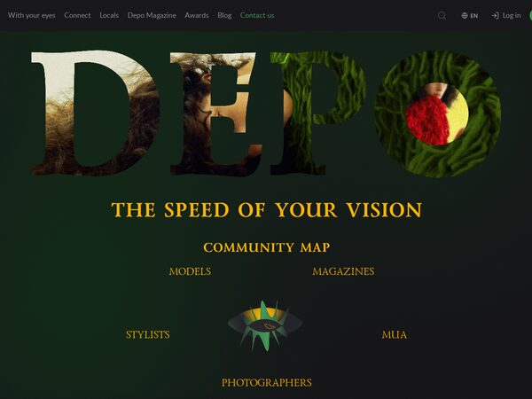
The DEPO guest home with the logo opening and an in-page editor. Album admins choose and position photos, tune every animation of the page, keep the result as templates with their own links, and give a developer an exact list of the changes.
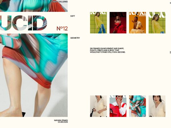
Five DEPO galleries as photo compositions that morph into each other — cards travel, new pictures wipe in diagonally, text rises line by line out of masks. The large card opens its gallery as a magazine issue: cover, contents, feature, spreads, quote, interview, next issue.
demo46's Connect page where every picture wears a frame or effect of its own — 100 numbered styles — with Like and Favourite in each corner and its style number after a 3 s hold; a Gallery block in the menu sets rows or grid (same card size) and all, none or one effect.
demo46's Connect page with a spotlight: the card under the pointer lifts and shows city · genre · issue while the rest of its row steps back into grey, and the rows fade out at the edge where more cards wait. Same rows / grid switch, same site sizes.
demo46's Connect page with a frame for every kind of card: partner issues in a gilded frame that turns and catches a sheen on hover, free magazines in a matted silver mount that warms up on hover, people in a DEPO-green ring. Same rows / grid switch, same sizes as the site.
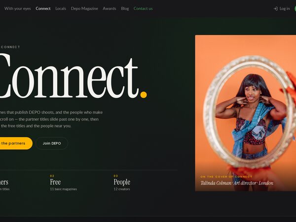
The dev0 Connect page as it is — banner, PARTNERS, FREE, People with the site's cards, pills and arrows — plus a rows / grid switch for the whole page: 220 partner issues in two sideways rows that always fit the screen, free magazines and people in one row each.
The Connect page with PARTNERS as a pinned scene: the page scroll slides the partner magazines sideways one spread at a time, with a big counter and ticks; then the free titles on a two-row rail and the people on a one-row rail, where the wheel scrolls the row.
The DEPO Connect page as cinema screens — a letterboxed banner, partners as 16:10 crops with the magazine name set huge across each card, wide FREE cards and a two-row People rail; the wheel scrolls the row under the cursor and the centred card is brighter.
The DEPO Connect page as feature + rail: every section is a large feature panel beside a horizontal rail; hovering or focusing a card crossfades it into the panel. Partners in one row, free magazines in two, people as portraits.