Turn the page
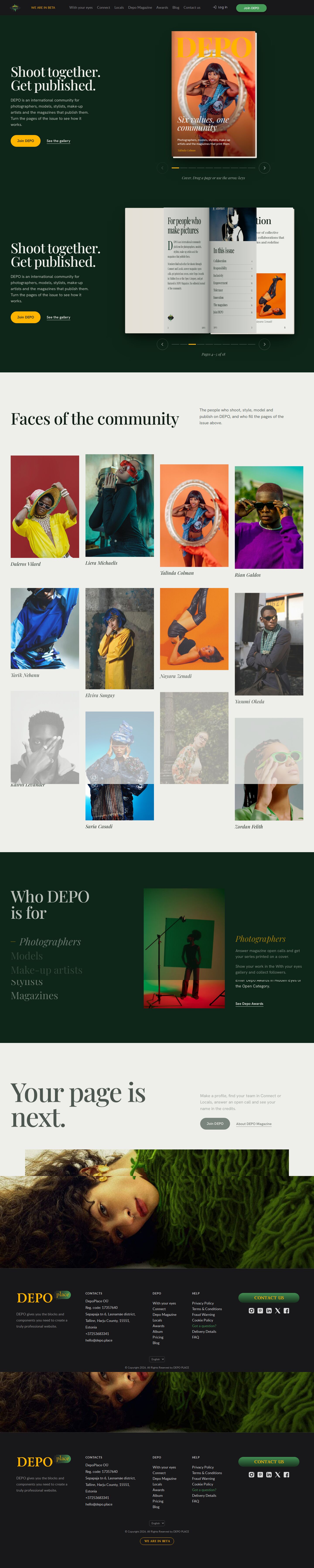
The hero is an open DEPO issue on a deep green ground. Its 18 pages turn in 3D by click, drag, swipe, arrow keys or the contents page, and the first pages turn by themselves as you start scrolling. Below it, faces in parallax columns, a role chooser and the closing call.
Summary
A home page for DEPO that is built around one object: a printed DEPO issue you can read. The first screen shows a headline ("Shoot together. Get published.") next to a realistic magazine that opens into two-page spreads and turns its pages in 3D. The issue holds the cover, what DEPO is, a contents page that jumps to any spread, one portrait feature per value (Collaboration, Responsibility, Inclusivity, Empowerment, Tolerance, Innovation), the magazines with their covers and a back cover with Join DEPO. Below the issue the page goes on in the same editorial voice: faces of the community in parallax columns, "Who DEPO is for" as a tabbed role chooser, and a closing "Your page is next." with a wide banner. It was one of the ten home pages (home10–home20) made to match the quality of the owner's favourite, home3 (demo5).
Prompt
The brief this page was built from.
Build a new home page for DEPO, a community where photographers, models, stylists, make-up
artists and magazines meet, shoot together and get published. Keep the real DEPO site header and
footer. Use real content only: the sections With your eyes, Connect, Locals, Depo Magazine,
Awards, Blog; the five roles; the six values (Collaboration, Responsibility, Inclusivity,
Empowerment, Tolerance, Innovation); the magazines Lucid, Palisade, ALAÏS, Delorian, VOÍD, DUSK,
Kaleido, Persona.Code; the shared covers and portraits. The bar is the home3 page (demo5):
premium, photo-led, editorial, rich but tasteful motion. Vanilla JS, self-hosted assets,
360–1920 px without horizontal scroll, visible focus, reduced motion respected.

Concept — "Turn the page": the hero is an open DEPO issue on a deep green ground — a realistic
two-page spread that turns its pages with a CSS 3D page-turn (click, drag on desktop, swipe on
phones, arrow keys) and also turns automatically a little as you start scrolling. Pages: cover,
what DEPO is, a portrait feature per value, the magazines, the back cover with Join DEPO. Below
the issue: elegant editorial sections (people with parallax, roles, Join). Palette: deep green
and paper with the brand yellow; a beautiful editorial serif + sans. On phones the issue shows
single pages.
Look
- Type: Playfair Display (400–900, with italics) for headlines, page titles, drop caps, the cover line and the italic page indicator; Hanken Grotesk 400–700 for body text, buttons and folios. The site header and footer keep the site's own fonts in
/demo16/fonts/. - Palette: deep green ground
#0e2619, green field#15382a, brand green#469a58(hover), paper#eeeeeaand a second paper tone#e1e2dc(pages, gutter shading), ink#13201a, soft ink#56625a(folios), brand yellow#ffb500(Join button, active scrubber tick, focus ring, the DEPO masthead on the cover). - Layout: the real DEPO header; the hero is a two-column grid — headline, lead and actions on the left (up to 460 px), the book on the right, sized from the viewport so a spread always fits. Under the book: previous / next buttons, a scrubber with one tick per spread and an italic "Pages 4–5 of 18" line. Then "Faces of the community" (four columns of portraits), "Who DEPO is for" (tabs on the left, portrait and three lines on the right, on deep green), "Your page is next." with the banner, and the real footer. Below 600 px the book shows one page per leaf.
- Motion: the pages are authored as a flat list; JS binds them into leaves with a front and a back face and turns them with
rotateYunderperspective: 2800px. A registered custom property (@property --peek) lets a leaf lift slightly on hover. Click / tap, pointer drag (the leaf follows the finger), arrow keys, the contents buttons and the scrubber all turn pages; while the visitor has not turned a page by hand, scrolling into the pinned hero turns the first pages. The book arrives with a rise-in animation, the intro lines rise in turn, the face columns move at different speeds on scroll (rAF-throttled), and the closing banner opens as it scrolls in. Reduced motion: no scroll turning and no parallax; without JS the pages are a horizontal strip you can scroll.
Built with
| Part | What |
|---|---|
| HTML | public/demo16/index.html |
| CSS | public/demo16/css/demo16.css + shared /demo16/css/ (globals, site, site-chrome, header, site-header, header-menus, app) for the site header and footer |
| JS | public/demo16/js/demo16.js — vanilla (pointer events, IntersectionObserver, requestAnimationFrame); plus the site's own /demo16/js/i18n.js, ellipses.js, site.js, app.js for the header menu and the log-in modal |
| Libraries | none |
| Fonts | Playfair Display, Hanken Grotesk (Google Fonts); Lato from /demo16/fonts/ for the site chrome |
| Images | the 12 community portraits and role pictures from /_img/site/first-page/, the 30 magazine covers from /_img/photos/, the DEPO eye /_img/site/logo/logo.png, the wide banner /_img/site/media/c217eb6b….png |
Borrowed
- The real DEPO site header and footer, copied 1:1 from the live site, and their styles and scripts from the site-asset snapshot (
/demo16/css/,/demo16/js/,/demo16/fonts/,/_img/site/) of the DEPO front (taken fromfront/at commit43a7a8b^). - The value texts, roles and magazine names are DEPO's own copy (the shared
build/shared.mjsdata of the home10–home20 batch). - The magazine covers in
/_img/photos/and the portraits are DEPO's demo photography. - Skills used while building:
frontend-designandtaste-skill(named in the shared brief). - No third-party code.
Config
None — static page.
Notes
- The page turn is the "live thing"; the contents page and the magazine list inside the issue (pick a title to see its covers) are real buttons, so the issue is usable from the keyboard.
- The book's size depends on the viewport height; on very short landscape screens the spread gets small.
Suits a site for…
What kind of website would this design fit? Agree with a tag by clicking it, or add your own — a tag can be several words.
No tags yet — be the first.
Comments 0
No comments yet — be the first.