Connect · Feature + Rail
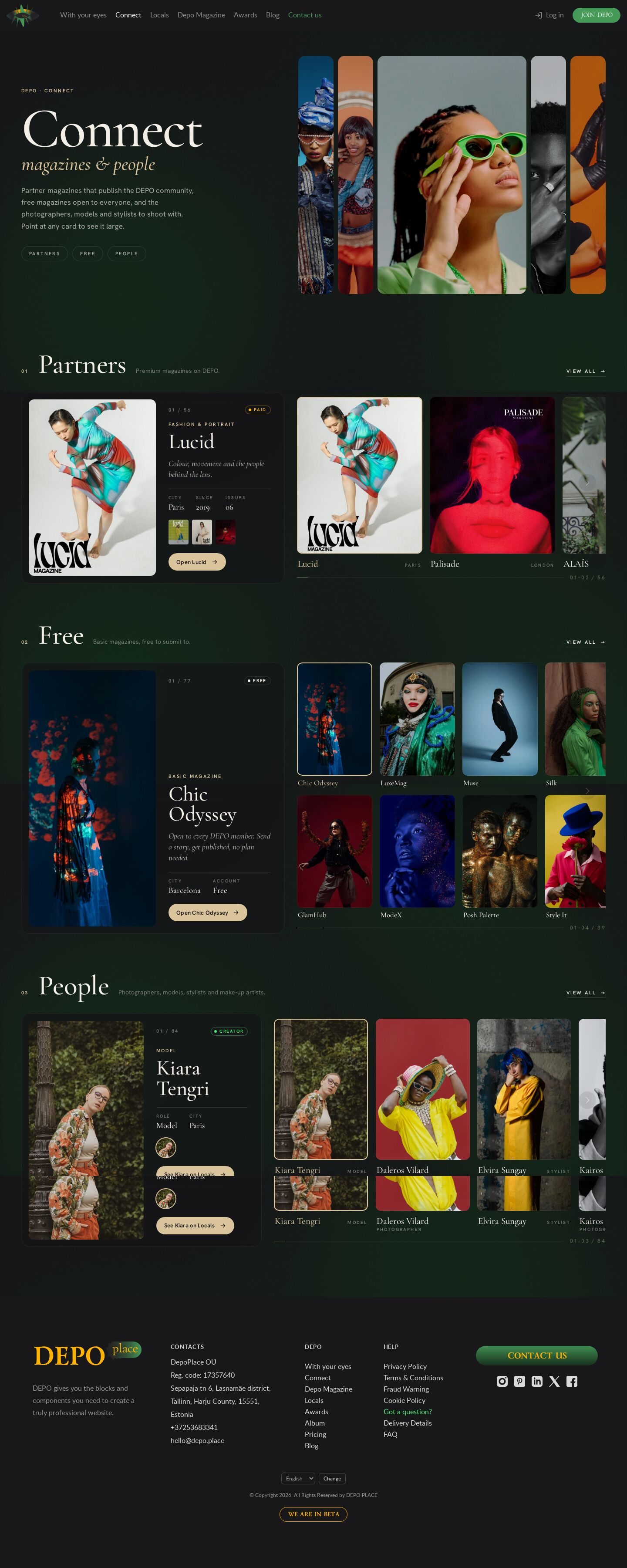
The DEPO Connect page as feature + rail: every section is a large feature panel beside a horizontal rail; hovering or focusing a card crossfades it into the panel. Partners in one row, free magazines in two, people as portraits.
Summary
One of ten presentations of the Connect page (demo36–demo45); this one is horizontal. Each section splits in two: on the left a large feature panel shows one item — the cover big, with its number, genre, name in Cormorant Garamond, line, facts and an "Open" button — and on the right a horizontal rail of cards. Point at a card (or Tab to it) and it crossfades into the feature; the card in the feature gets a champagne frame and the others step back. PARTNERS is one row, FREE two rows, People one row of portraits whose feature shows name, role and city. The wheel over a rail moves the rail and hands back to the page at its ends; the controls are quiet edge zones and a progress line inside the row. The banner is a strip of five portraits; the one under the pointer opens wide.
Prompt
The brief this page was built from.
Build one page of the DEPO demo album: the DEPO Connect page (https://dev0.dphub.net/connect)
as "feature + rail", a horizontal presentation. Content in this order: page banner, PARTNERS
(56 premium magazines), FREE (77 basic magazines), People (84 creators), with "view all" links to
https://dev0.dphub.net/premium, /basic and /locals; cards rendered in vanilla JS from the shared
js/connect-data.js. Keep the real DEPO header and footer, the dark site ground and the shared
animated background (/demo20/js/shared.js, .ellipses first in body; no opaque page fill).

Function: the shared rail engine js/rail.js + css/rail.css (<div class="rail" data-rail
[data-rail-rows="2"]><div class="rail__track" data-rail-track>…). The wheel over a rail scrolls
that rail (eased) and returns to the page at its ends; mouse drag; keyboard; touch swipes
natively. No big arrows above the rows: semi-transparent edge zones with a chevron and a thin
progress line "01–03 / 56" live inside the row.

Design: a gallery wall, premium and quiet. Every section is split: a large feature panel on the
left (cover big + details: "01 / 56", genre, name, line, City / Since / Issues, small issue
covers, an "Open" pill; Paid / Free / Creator badges) and the rail on the right. Hovering or
focusing a rail card crossfades it into the feature (two stacked layers, opacity 0.55 s, a
90 ms hover delay against flicker); the featured card gets a champagne frame, the others dim
while the pointer is over the rail. On touch the feature follows the first card in view.
PARTNERS one row of 4:5 covers, FREE two rows of 2:3 covers, People one row of portraits whose
feature shows name / role / city and the avatar. Banner: "Connect — magazines & people" in
Cormorant Garamond with a strip of five portraits; the one under the pointer widens. On phones
the feature sits above its rail. Responsive to 375 px, reduced motion, visible focus.
Look
- Type: Cormorant Garamond 500 / 600 and italic for titles, names and lines; Hanken Grotesk for labels and body.
- Palette: site ground
#18171a, ivory#f3eee6, panelsrgb(22 21 24 / 0.72)with backdrop blur, champagne#d9c49cfor the active card, kicker and buttons, gold#ffb500Paid, green#53f57eCreator. - Layout: banner (headline | portrait strip) · three sections, each: head (number, title, note, view all) and a 46 / 54 split of feature panel and rail (People 42 / 58); below 900 px the feature stacks above the rail.
- Motion: feature crossfade with a slight image settle (scale 1.04 → 1); the banner strip's open photo grows with a long ease (flex-grow); dimming of the non-featured cards; rail glide from rail.js. Reduced motion removes the transitions.
Built with
| Part | What |
|---|---|
| HTML | public/demo43/index.html |
| CSS | public/demo43/css/demo43.css, css/rail.css (shared rail structure) (+ the site kit: site.css, site-chrome.css, header.css, ellipses.css) |
| JS | public/demo43/js/demo43.js — vanilla, renders rails and features, the crossfade; js/rail.js — shared rail engine; js/connect-data.js (shared data); js/ellipses.js, js/header.js (kit); /demo20/js/shared.js (shared background) |
| Libraries | none |
| Fonts | Cormorant Garamond, Hanken Grotesk (Google Fonts); self-hosted in public/demo43/fonts/: Lato, Poppins, Lazurski (header only) |
| Images | /_img/photos/ (partner covers), /_img/site/first-page/ (banner portraits, free magazines, people) |
Borrowed
Nothing borrowed. The header, footer and background are the album's copy of the DEPO site chrome.
Config
None — static page.
Notes
- 2026-10-23: seven times the content — 56 partners (the original eight, Depo Magazine and 47 more) with 220 issues, 77 free titles, 84 people (js/connect-data.js, the same file in every Connect demo). The album has ~30 covers and 24 portraits, so the new entries reuse them as close-up crops in
/_img/photos/crops/(logos cropped away;mag1–4.jpgare the Depo Magazine covers from front/public/images/depo-magazine/), spread so the same photo never sits next to itself. - rail.css adds
display:block; gap:0; padding:0; overflow:visible; scroll-snap-type:noneto.rail, because site.css has its own.railslider rule. - The feature panel's height is the taller of its two layers (they share one grid cell), with a minimum per section so swapping items does not make the page jump.
html { scroll-behavior: auto }here too; the banner links glide by script.
Suits a site for…
What kind of website would this design fit? Agree with a tag by clicking it, or add your own — a tag can be several words.
No tags yet — be the first.
Comments 0
No comments yet — be the first.