Saria Woven Thread
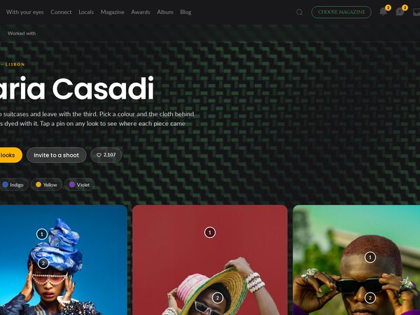
Stylist profile in the album UI. A woven cloth is the background and lifts under the pointer. Colour filters dye the cloth and filter the looks; numbered pins on each photo credit the pieces.
Every page we tried for DEPO, one post each: what it is, how it was built, how it looks.
65 demos
Stylist profile in the album UI. A woven cloth is the background and lifts under the pointer. Colour filters dye the cloth and filter the looks; numbered pins on each photo credit the pieces.
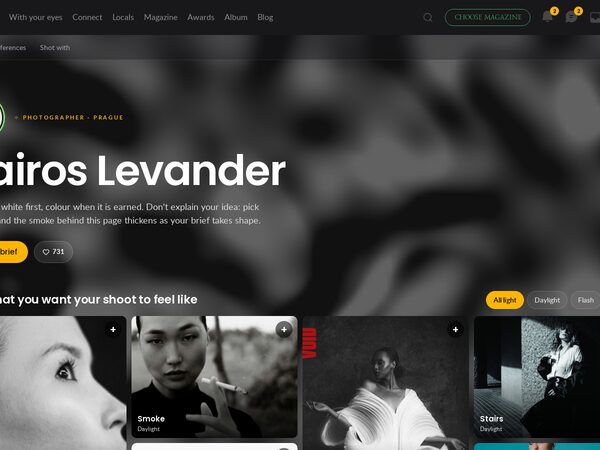
Photographer profile in the album UI. Pick the pictures your shoot should feel like: silver smoke thickens with each pick and the picks become a written brief, ready to copy or send.
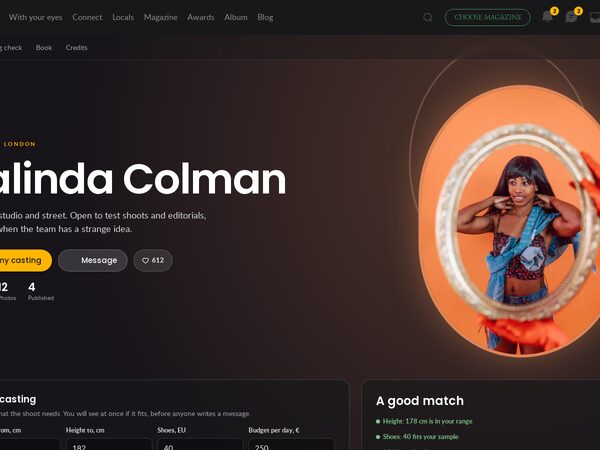
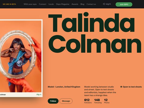
Model profile in the album UI. Oval rings ripple from the mirror portrait and from every click. A casting check compares a brief with her measurements, calendar and rates and gives a verdict.
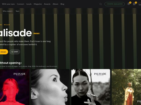
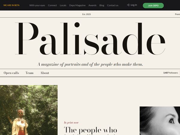
Palisade magazine profile in the album UI. Light falls through a fence that leans with the pointer. Move across a cover to skim its pages, or search the credits by name or role.
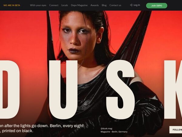
DUSK magazine profile in the album UI. Drag to your finish date: calls you would miss go grey, and the sun behind the page sinks as the next deadline gets close.
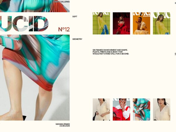
Lucid magazine profile in the product UI of the DEPO album. Choose an issue and the animated background takes its colours. A call matcher sorts open calls by your team, picture count and location.
Stylist profile on DEPO for Saria Casadi. Five look panels widen under the pointer, then the same looks stack as coloured cards with notes on each, followed by what is in the suitcase and who she worked with.
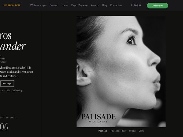
Photographer profile on DEPO for Kairos Levander. A fixed identity column stays beside one large picture per screen, with a filter, a running count, and lists of where the work was published and who it was shot with.
Model profile on DEPO for Talinda Colman, built round a comp card that flips to show measurements. Then an offset parallax book, a month of bookable days and a list of published credits.
Palisade magazine profile on DEPO as an ivory serif register. A centred masthead, sticky tabs for issues, open calls, team and about, and a list of issues where the cover follows the cursor.
DUSK magazine profile on DEPO, a dark poster page. The full-screen cover carries a giant wordmark, back issues run sideways under the wheel, and a red open-call panel counts down to its deadline.
Lucid magazine profile on DEPO. A pinned cover turns like a page through five issues while the ground takes each cover's tint; open calls open as rows; a mosaic of pages and the masthead close it.
What DEPO does, told by one series: a person as they are, then make-up, then hair, then the magazine cover. The same four frames in four versions: aperture blades, a shutter you press, turning slats, and prints that land on a pile.
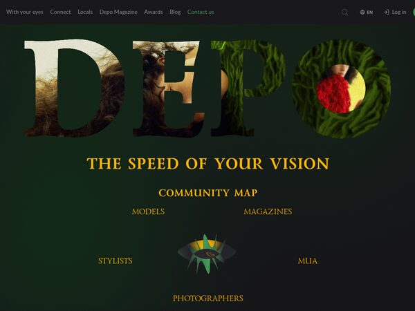
The DEPO guest home with the logo opening and an in-page editor. Album admins choose and position photos, tune every animation of the page, keep the result as templates with their own links, and give a developer an exact list of the changes.
Five DEPO galleries as photo compositions that morph into each other — cards travel, new pictures wipe in diagonally, text rises line by line out of masks. The large card opens its gallery as a magazine issue: cover, contents, feature, spreads, quote, interview, next issue.
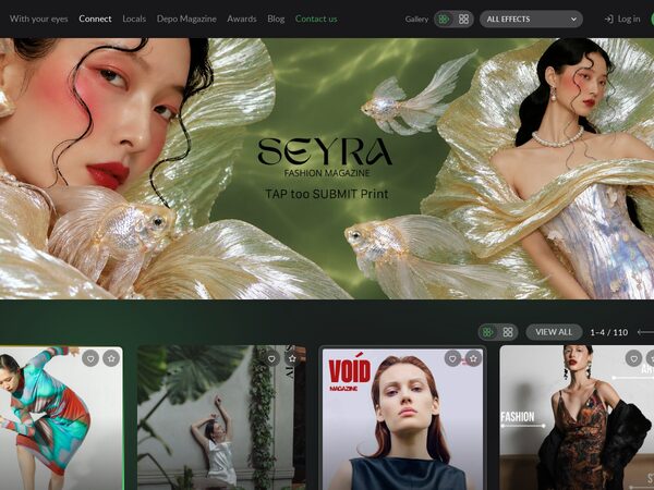
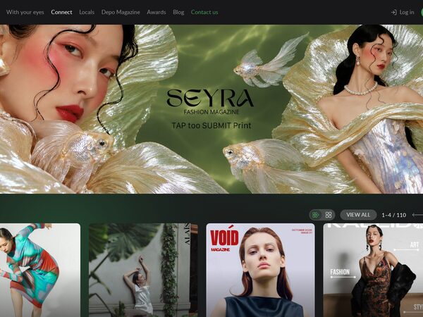
demo46's Connect page where every picture wears a frame or effect of its own — 100 numbered styles — with Like and Favourite in each corner and its style number after a 3 s hold; a Gallery block in the menu sets rows or grid (same card size) and all, none or one effect.
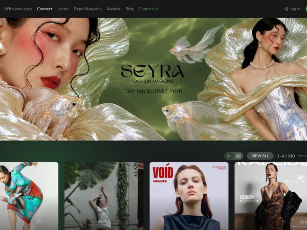
demo46's Connect page with a spotlight: the card under the pointer lifts and shows city · genre · issue while the rest of its row steps back into grey, and the rows fade out at the edge where more cards wait. Same rows / grid switch, same site sizes.
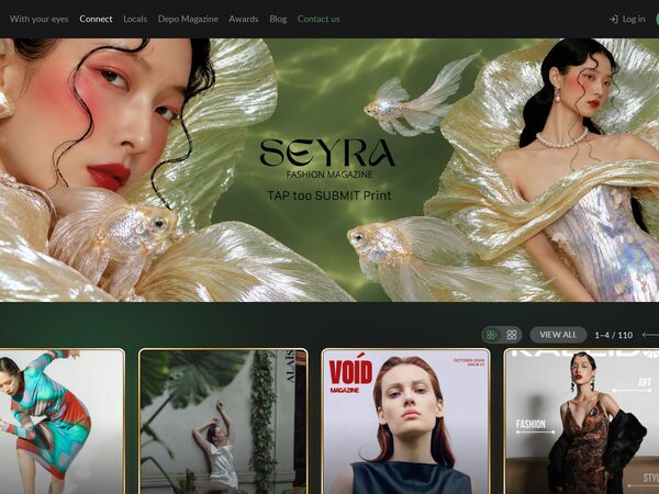
demo46's Connect page with a frame for every kind of card: partner issues in a gilded frame that turns and catches a sheen on hover, free magazines in a matted silver mount that warms up on hover, people in a DEPO-green ring. Same rows / grid switch, same sizes as the site.
The dev0 Connect page as it is — banner, PARTNERS, FREE, People with the site's cards, pills and arrows — plus a rows / grid switch for the whole page: 220 partner issues in two sideways rows that always fit the screen, free magazines and people in one row each.
The Connect page with PARTNERS as a pinned scene: the page scroll slides the partner magazines sideways one spread at a time, with a big counter and ticks; then the free titles on a two-row rail and the people on a one-row rail, where the wheel scrolls the row.