Four Frames
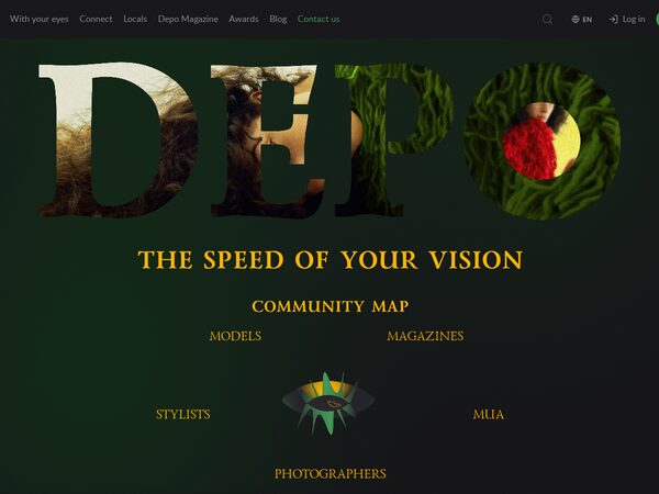
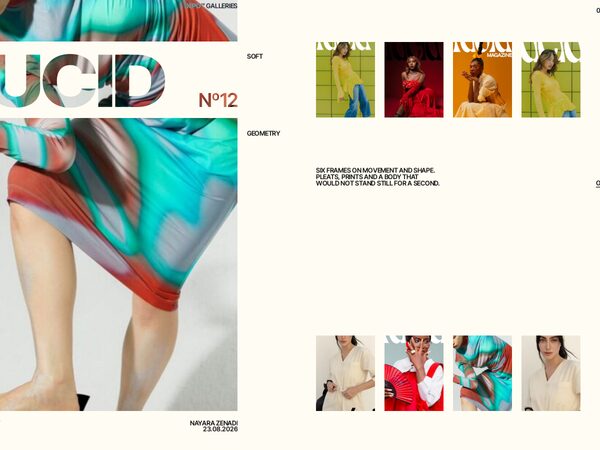
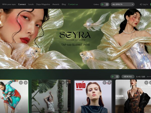
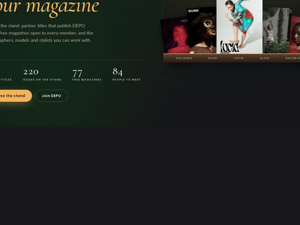
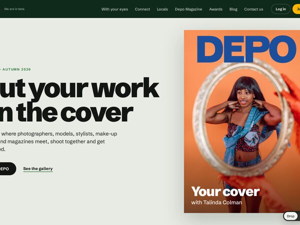
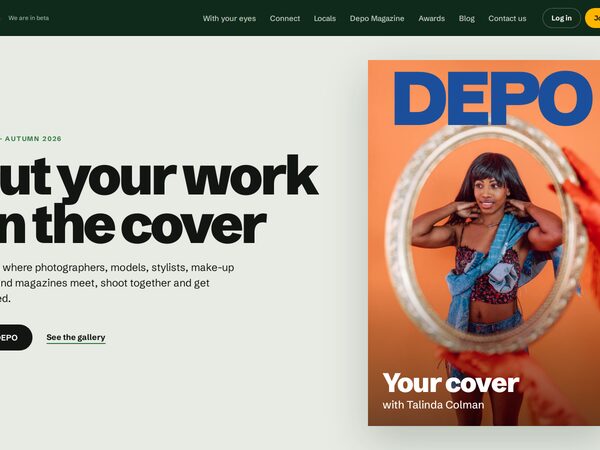
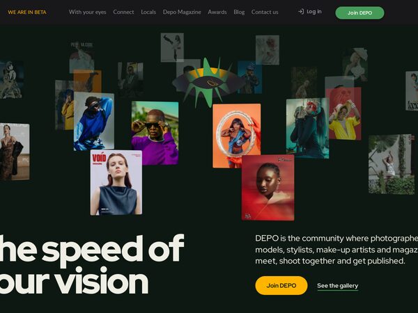
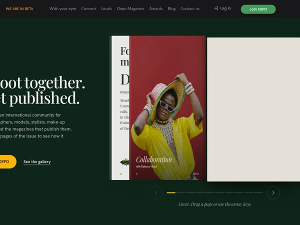
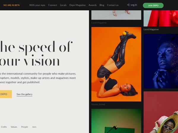
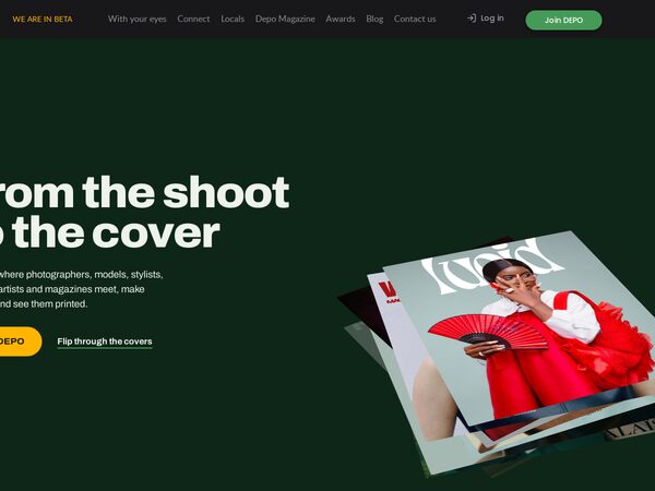
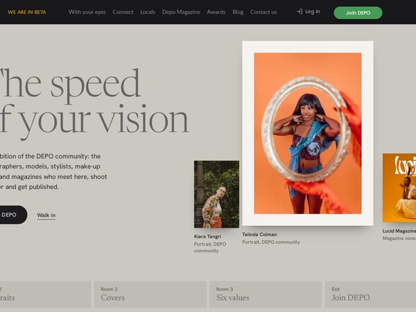
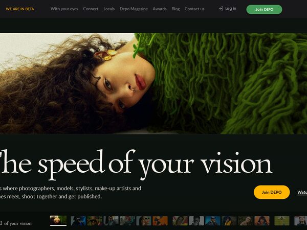
What DEPO does, told by one series: a person as they are, then make-up, then hair, then the magazine cover. The same four frames in four versions: aperture blades, a shutter you press, turning slats, and prints that land on a pile.
Every page we tried for DEPO, one post each: what it is, how it was built, how it looks.
53 demos
What DEPO does, told by one series: a person as they are, then make-up, then hair, then the magazine cover. The same four frames in four versions: aperture blades, a shutter you press, turning slats, and prints that land on a pile.
The DEPO guest home with the logo opening and an in-page editor. Album admins choose and position photos, tune every animation of the page, keep the result as templates with their own links, and give a developer an exact list of the changes.
Five DEPO galleries as photo compositions that morph into each other — cards travel, new pictures wipe in diagonally, text rises line by line out of masks. The large card opens its gallery as a magazine issue: cover, contents, feature, spreads, quote, interview, next issue.
demo46's Connect page where every picture wears a frame or effect of its own — 100 numbered styles — with Like and Favourite in each corner and its style number after a 3 s hold; a Gallery block in the menu sets rows or grid (same card size) and all, none or one effect.
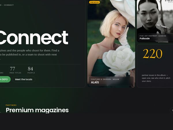
demo46's Connect page with a spotlight: the card under the pointer lifts and shows city · genre · issue while the rest of its row steps back into grey, and the rows fade out at the edge where more cards wait. Same rows / grid switch, same site sizes.
demo46's Connect page with a frame for every kind of card: partner issues in a gilded frame that turns and catches a sheen on hover, free magazines in a matted silver mount that warms up on hover, people in a DEPO-green ring. Same rows / grid switch, same sizes as the site.
The dev0 Connect page as it is — banner, PARTNERS, FREE, People with the site's cards, pills and arrows — plus a rows / grid switch for the whole page: 220 partner issues in two sideways rows that always fit the screen, free magazines and people in one row each.
The Connect page with PARTNERS as a pinned scene: the page scroll slides the partner magazines sideways one spread at a time, with a big counter and ticks; then the free titles on a two-row rail and the people on a one-row rail, where the wheel scrolls the row.
The DEPO Connect page as cinema screens — a letterboxed banner, partners as 16:10 crops with the magazine name set huge across each card, wide FREE cards and a two-row People rail; the wheel scrolls the row under the cursor and the centred card is brighter.
The DEPO Connect page as feature + rail: every section is a large feature panel beside a horizontal rail; hovering or focusing a card crossfades it into the panel. Partners in one row, free magazines in two, people as portraits.
The Connect page as a newsstand at night: all 220 partner issues on a two-row shelf grouped by magazine, free titles in two rows, people in one. The wheel scrolls the row under the cursor; quiet controls sit inside each row.
The cleanest, product version of the DEPO Connect page and the reference rail engine — every section is one row (3:4 partner covers, smaller FREE cards, portraits); the wheel scrolls the row under the cursor, with quiet glass edge zones and a thin "03–06 / 56" progress line inside each row.
The Connect page as a premium kiosk at dusk: one lamp-lit walnut shelf per partner magazine with its issues fanned on it and leaning toward the cursor, free titles on an open rack, people as paper contact cards. All wrapping grids, no sideways scrolling.
The DEPO Connect page as a precise bento grid — the featured partner as a 2×2 tile with its next issues, mixed tall, wide and square tiles with glass captions, FREE as a dense six-column grid and People as a portrait bento.
The DEPO Connect page as a stack of cards: each partner magazine is a near-full-screen card that sticks and is covered by the next one, scaling down and dimming as it goes; free magazines and people follow as quiet grids.
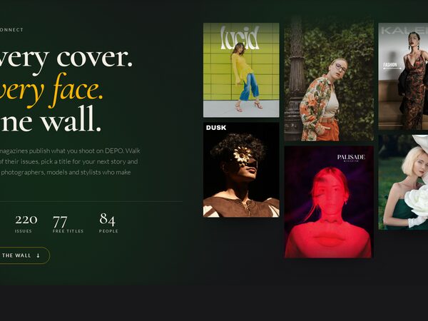
The DEPO Connect page as a wall of all 220 partner issues in four columns that drift at different speeds as you scroll, with a sticky index of the 56 magazines beside it. Free titles follow as a quiet mosaic and the people as a staggered portrait grid.
The DEPO Connect page as a typographic index — one ruled row per partner magazine with its name set huge in a light serif and city, genre, year and issues in small caps; hover a row and its cover floats by the cursor while the rest dim. FREE and People are calm four-column grids.
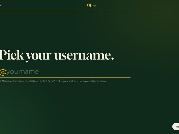
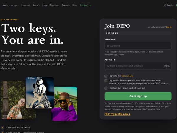
Sign-up as a conversation: one big question per screen, Enter to go on, quick sign-up after the password, every profile question skippable, in DEPO's order of importance; a complete profile earns 7 days of full access.
Sign-up beside a magazine cover that builds itself as you type: your @username, name, roles and city become the cover lines. Two fields for a quick start; fill the whole cover for 7 days of full access.
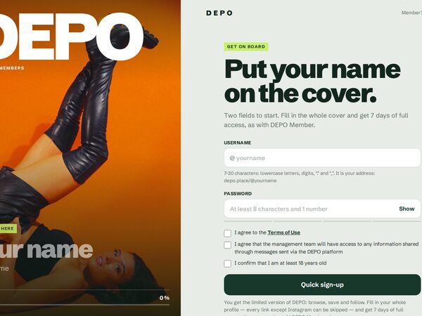
The fastest DEPO sign-up in the live site's look: a username and a password, the three required boxes, Quick sign-up into the limited version — or the full profile on the same page in DEPO's order, with 7 days of full access for a complete one.
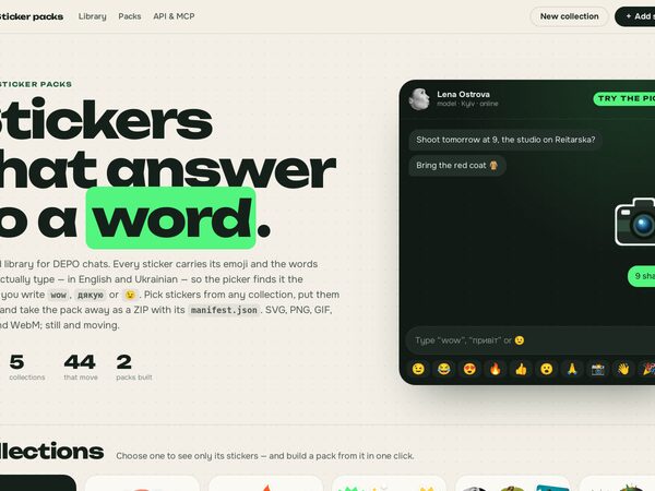
A shared DEPO sticker library — SVG, PNG, GIF, WebP and WebM, still and moving. Emoji and words call each sticker up in a chat picker; likes, a shared trash that is never emptied, packs downloaded as ZIP. Open API and MCP server.
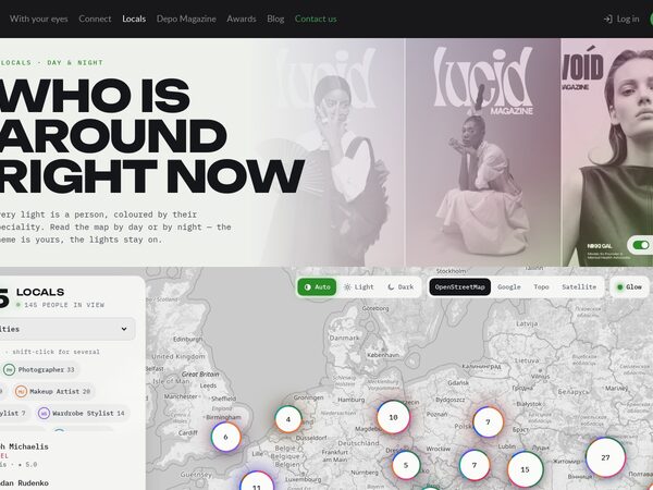
Locals by day or by night: demo27's glowing speciality lights and glow layer, demo25's side panel with chips, people in view and the card, and a light and a dark theme for every base map — OpenStreetMap, Google, Topo, Satellite. Remembered; follows the system theme until you choose.
5762 numbered DEPO components in a database — 2183 buttons (own, every button of the owner's generator files), 300 paginations and arrows, 3279 icons — with votes, a top, a shared trash, an editor that reads even raw code and saves new pieces, and an import for AI-made buttons.
A nebula to breathe with: seven huge colour fields — azure, amethyst, violet, amber, blue haze — drift on slow sine curves, swell and fade on near-black, blurred so far that only colour remains, under a fine noise veil. No text, no controls.
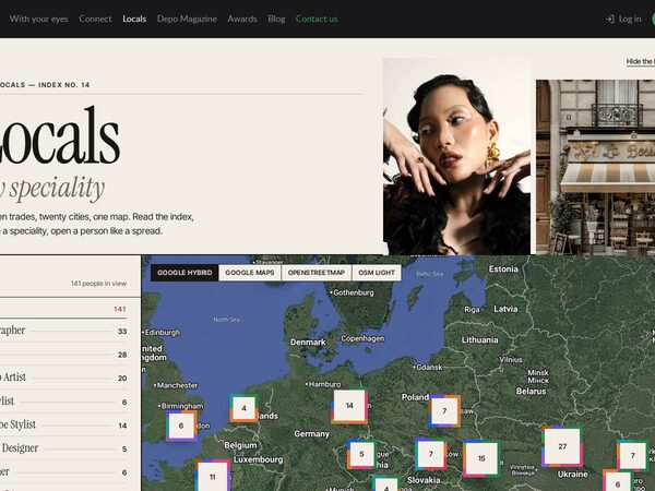
Locals as a magazine index: an editorial banner (switchable), a numbered contents list of the 14 specialities with counts beside a Google hybrid map of photo stamps; pointing at an entry dims the rest; a person opens as a spread.
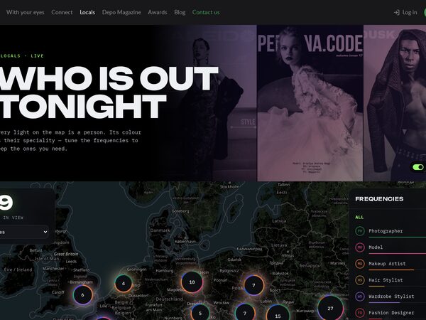
Locals at night: a cinematic duotone banner (switchable), a dark map where every person is a light in the colour of their speciality over a soft glow layer, and a frequency panel — one bar per speciality, as long as its share of the people in view.
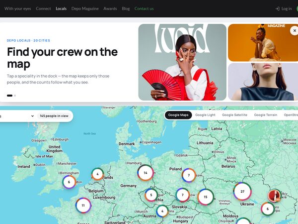
Locals on Google Maps: a rounded banner card inside the page width (switchable), then the map with a search pill, a dock of the 14 specialities with live count badges and a carousel of the people in view; a person opens as a popup.
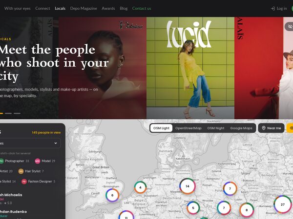
The live /locals page as a map: the site banner with four portraits per slide, switchable, then a map that fills the screen with a dark glass panel — speciality chips with live counts, the people in view and a card. OpenStreetMap (grey, colour, night) and Google Maps.
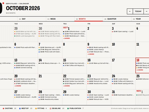
The DEPO calendar as a Swiss poster: off-white, black 2px rules, one red, Archivo from condensed to normal, numbered views 01–06 and a giant date in the corner. Every event sits on a 15-minute raster.
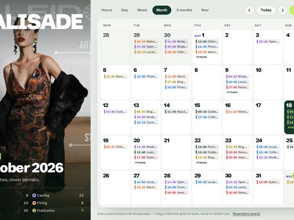
The DEPO calendar beside a magazine cover: the photo, the magazine name and the cover line change with the month; the year view is twelve covers with their days. Pale green-grey, Schibsted Grotesk 900, lime accents; 15-minute events.
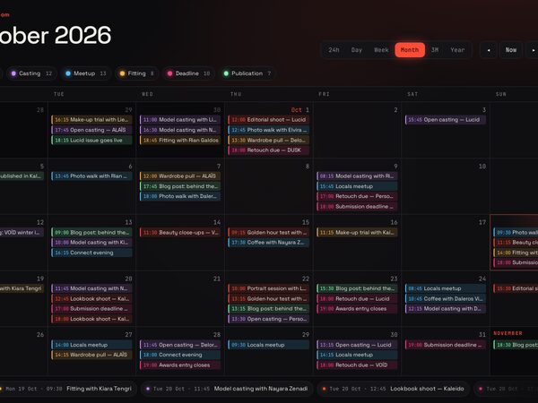
The DEPO calendar in a darkroom: near-black, safelight red that follows the pointer, JetBrains Mono numerals, glowing event bars and a ticker of what is next. Hours, day, week, month, three months and year; 15-minute events you drag.
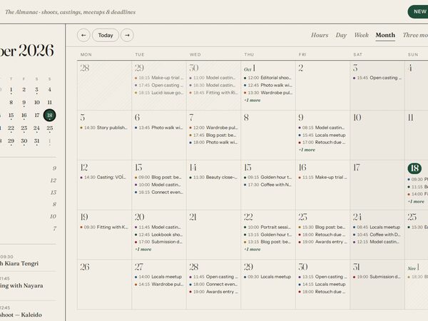
The DEPO calendar as a printed almanac: warm paper, Fraunces numerals and hairlines, a left rail with the small month, event types and what is coming up. Six views from hours to year; every event moves in 15-minute steps.
The live DEPO header and footer with two empty screens between them, so nothing covers the site's animated background — soft green spots that fade in, drift to new places and fade out. Every setting of the animation is exposed and documented, with live controls at ?tune.
The second version of demo18. Every page has its own address (/demo19/gallery, /demo19/contact-us) and is rendered by PHP for a first visit or a search engine; moving inside the site fetches only the next page's block and plays one of three transitions — drop, side or deck.
The whole DEPO site as one page that never reloads. The header stays put; every opened menu page becomes a slide in a horizontal deck, the old one slides off to the left, and pages already opened keep their scroll. The address changes (?p=gallery) and Back / Forward move the deck.
The community as a constellation on a dark forest ground. Portraits and magazine covers circle the DEPO eye on two tilted rings that follow the pointer and the scroll, then unwrap into a grid of people. Choosing a role turns a second orbit; the close is a ring of faces.
The hero is an open DEPO issue on a deep green ground. Its 18 pages turn in 3D by click, drag, swipe, arrow keys or the contents page, and the first pages turn by themselves as you start scrolling. Below it, faces in parallax columns, a role chooser and the closing call.
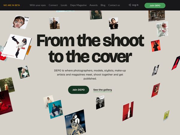
Thirty real magazine covers start scattered in 3D around the headline and fly into one wall as you scroll. The wall filters by magazine, then the camera dives into one cover, which becomes the ground of the next chapter. Warm stone, deep green, Bricolage Grotesque.
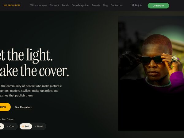
A dark photo studio where one warm key light does all the work. In the hero it follows the pointer and reveals the colour portrait over its dim copy, with a Warm/Cool, Soft/Hard console; below, faces walk through a fixed light and each value switches on like a lit set card.
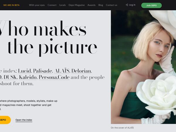
DEPO set like a luxury publisher's index. Huge Didone lists of magazines, people and roles on a cool grey ground, real covers trailing the cursor, a hovered row's picture following the pointer, and one pinned deep green chapter for the values.
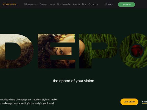
The word DEPO set huge on deep green with a photograph inside its letters; scrolling flies the camera through the O until the studio picture fills the screen. Every later section opens through a round aperture, and an f-stop dial opens a role portrait.
A fashion-house split screen. A soft-white editorial panel in Bodoni Moda changes chapter as you scroll while two columns of real covers and portraits travel in opposite directions beside it; choosing a craft brings its pictures back to colour.
Thirty real magazine covers handled as paper objects in CSS 3D on deep green. A pinned pile lifts off the table, stands up and deals covers toward you while the magazine name is set huge beside each one; further down, a deck of every cover flips by drag, swipe or keys, filtered by title.
The home page as a walk through a photography exhibition of the DEPO community. Works hang at different sizes with museum labels on stone, deep green and charcoal walls that change tone room by room; the covers corridor is walked sideways, and any of the 31 works opens in a zoomable viewer.
DEPO told as a film's opening sequence on a deep green-black ground. A scope shot dollies into a close-up, the cast wipes in as full-screen portraits with their names as credits, the values are chapters, and a credits roll ends on Join DEPO. A scene strip jumps between the 15 scenes.
The home page read like an issue of DEPO. A pinned stage turns vertical scroll into sideways page turns through full-width spreads (cover, contents, six value features, credits, magazines, back cover), with photo and type parting in depth and a bar that opens the contents.
The Cover (demo5) with one change: once the site header has scrolled away, moving the pointer up towards the top of the screen pulls it back down bit by bit, and it locks in place near the top. Drop the pointer and it slides away.
The owner's favourite and the bar for every later demo. A light, editorial DEPO: a magazine cover with the DEPO masthead stays pinned while the text scrolls, and each of the six values becomes the cover line of a new issue with a community portrait as its star.
The improved original in the DEPO brand (dark, gold Lazurski, green action), every block reworked: headline beside the banner photo with fanned covers, a cover wall filtered by magazine, values under a sticky title, a role switcher, a cover band and staggered faces.
Speed of Your Vision (demo2) re-skinned as a restrained "future studio": deep graphite ground, indigo and violet glow, frosted-glass panels, monospace captions, a thin gradient progress bar and a custom glowing cursor that opens into a ring over links.