Connect · Frames
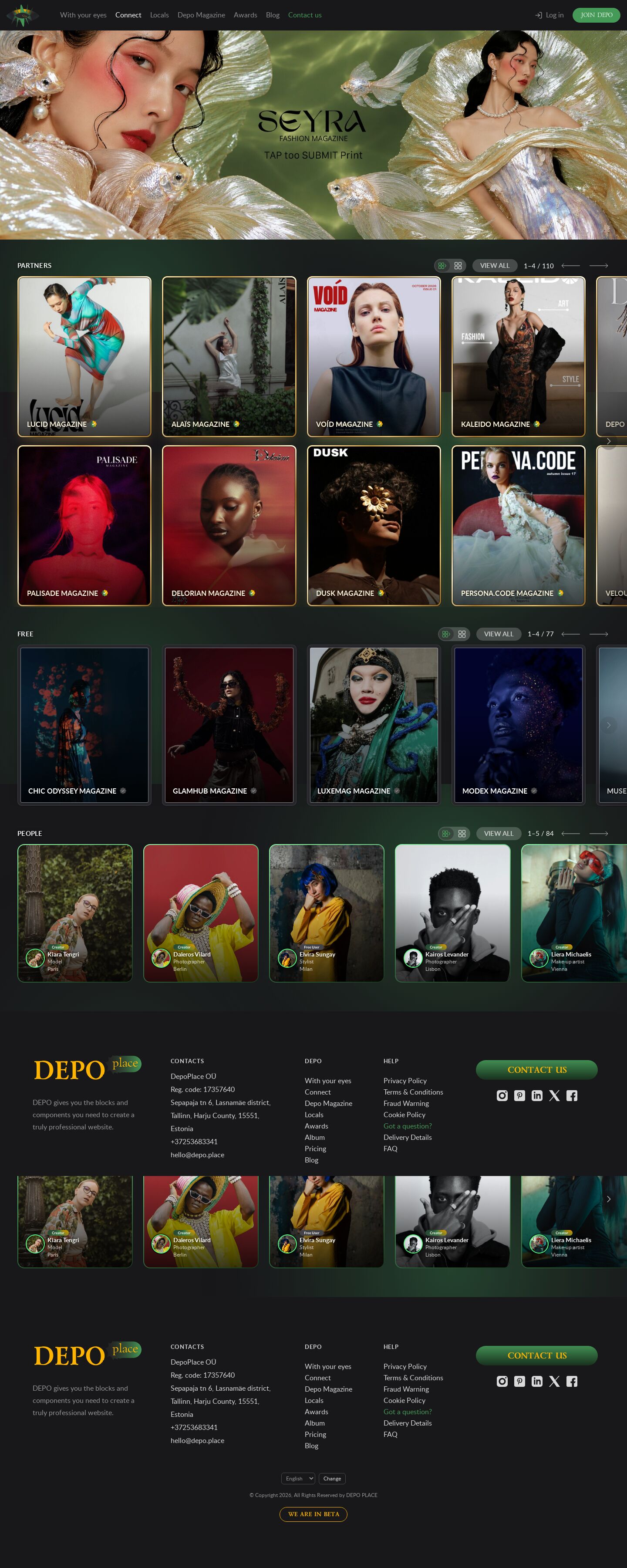
demo46's Connect page with a frame for every kind of card: partner issues in a gilded frame that turns and catches a sheen on hover, free magazines in a matted silver mount that warms up on hover, people in a DEPO-green ring. Same rows / grid switch, same sizes as the site.
Summary
The same page, sizes and view switch as demo46, but every card says what it is through its frame. Partners — the paid titles — sit in a gilded frame with a hair of dark between gold and picture and a warm glow; on hover the gold turns and a sheen crosses the cover. Free magazines are mounted on a dark passe-partout with a silver hairline, a little muted until pointed at. People wear a ring of DEPO greens, their avatar ringed the same.
Prompt
The brief this page was built from.
Rebuild the DEPO Connect page (https://dev0.dphub.net/connect; front/templates/connect/ and
front/public/css/modules/Publish.css) as a demo page with the live header, footer and green
animated background, and keep its measures: the page banner edge to edge under the header (8:3,
at most 480 px, the live slides fading), then PARTNERS, FREE and People. Each section head is
the site's: a small uppercase title on the left; on the right a two-icon view switch, the grey
"VIEW ALL" pill, the position ("1–4 / 110") and the site's long arrows. No extra headings,
ledes or explanations.

- View switch: rows (horizontal scroll) or grid (cards wrap, the page scrolls). One switch for
  the whole page: the icons in every head change all three blocks at once; the choice is
  remembered in the browser (and ?view=grid opens the grid).
- Rows: PARTNERS in two rows that scroll together sideways; FREE in one row; People in one row,
  the same cards as the magazines, a little smaller (no panel or box around them). The wheel over a row scrolls that row and hands back to the
  page at its ends; mouse drag; keyboard; quiet semi-transparent edge zones inside the row.
- Size: the site's 1 : 1.2 cards with 10 px corners, a little smaller than live. The card height
  comes from the screen height, so that the header, the section head and both partner rows fit
  on one screen with at least 10 px left under them; on short or narrow screens the cards shrink
  (on phones at least two side by side).
- Content: at least as many cards as demo42 — every partner issue (220, interleaved so that
  neighbours are different magazines), 77 free magazines, 84 people — from the shared
  js/connect-data.js; captions "<NAME> MAGAZINE" with the site's paid / free badges; people with
  avatar, badge, name, profession and city.

Design: demo46's page; the frames do the talking — gold (#fbe9b0 → #c9993f → #fff6d8 → #8d6420) for partners, a dark matte #26252a with a silver hairline for free magazines, greens #8dfaa8 → #469a58 → #18341e for people.
Look
- Type: Lato (captions, pills, position), the site chrome's Poppins and Lazurski — all from the live site, self-hosted in public/demo47/fonts/.
- Palette: page #18171a with the green background; text #fff, secondary rgb(255 255 255 / 0.7); pills rgb(255 255 255 / 0.2); accent #469a58 (the pressed view icon, hover).
- Layout: header (70 px, sticky) · banner (8:3, ≤ 480 px) · PARTNERS (head 44 px, two rows) · FREE (one row) · People (one row, cards at 86 %) · footer. Card height = (100svh − header − 14 px − head − 18 px row gap − 14 px) / 2, between 120 and 440 px, and at most 44vw × 1.2 on phones; width = height / 1.2; gaps 24 px (the site: 40 px). Grid view: 4 / 3 / 2 columns (people 5 / 4 / 2), 32 px gaps.
- Cards: partners: a 3 px gold gradient band (CSS
@property --gildturns it on hover), a dark inner hairline, a sheen sweeping across, a warm drop glow; free: 7 px matte, silver hairline, picture saturate(0.7) until hover; people: a 2 px green gradient ring, 16 px corners, a green glow on hover, the avatar ringed in green. - Motion: the gold turn (1.4 s) and the sheen (1.1 s) on hover, the banner fade; all off under reduced motion.
Built with
| Part | What |
|---|---|
| HTML | public/demo47/index.html — the live header and footer, the banner, three sections with data-rail (partners data-rail-rows="2") |
| CSS | public/demo47/css/demo47.css — page, sizes, view switch, cards; css/rail.css (rail structure); css/site.css, site-chrome.css, header.css, ellipses.css (site copies) |
| JS | public/demo47/js/demo47.js — renders the cards, the view switch, the heads' position and arrows, the banner fade (vanilla); js/rail.js — the rail engine (wheel, drag, keys, edge zones); js/connect-data.js — the content; js/ellipses.js, js/header.js |
| Libraries | none |
| Fonts | Lato, Poppins, Lazurski (site chrome), self-hosted |
| Images | public/demo47/img/banner-1…3.jpg (the live /connect banner slides), the site's badges and arrow (front/public/images/users/, images/svg/); covers and portraits from /_img/photos/ (+ crops/) and /_img/site/first-page/ |
Borrowed
- dev0.dphub.net/connect (2026-10-24): the layout and every measure from front/public/css/modules/Publish.css (1 : 1.2 cards with 10 px corners, the shade gradient, the caption type, the VIEW ALL pill, the arrow), the banner proportion from front/public/css/site.css
.page-banner, the three banner slides and the badge / arrow icons from the site. - js/rail.js, css/rail.css, js/connect-data.js: the shared Connect kit of demo36–45.
Config
None (static page). The view choice is kept in localStorage depo-connect-view.
Notes
- The copied site footer overflows at 992–1365 px (its 280 px "Contact us" button and fixed columns); demo47.css makes those columns fluid in that range. The live front has the same bug (docs/backlog.md in the repository).
Suits a site for…
What kind of website would this design fit? Agree with a tag by clicking it, or add your own — a tag can be several words.
No tags yet — be the first.
Comments 0
No comments yet — be the first.