DEPO Demo album

Every page we tried for DEPO, one post each: what it is, how it was built, how it looks.

53 demos

All demos

46–50 of 53

Per page 5 10 20 50

–/10 0 comments

The Issue

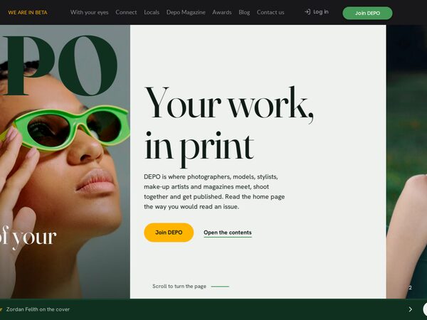
The home page read like an issue of DEPO. A pinned stage turns vertical scroll into sideways page turns through full-width spreads (cover, contents, six value features, credits, magazines, back cover), with photo and type parting in depth and a bar that opens the contents.
Read the post Open the demo

–/10 0 comments

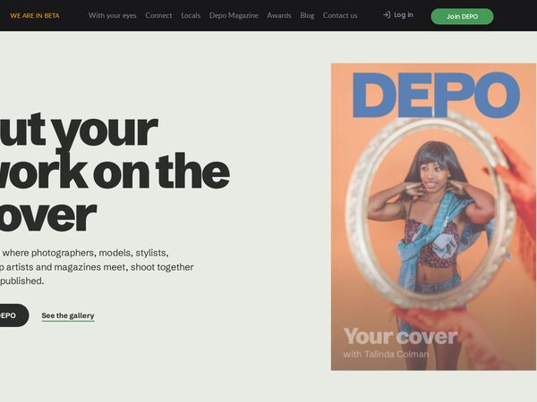
The Cover

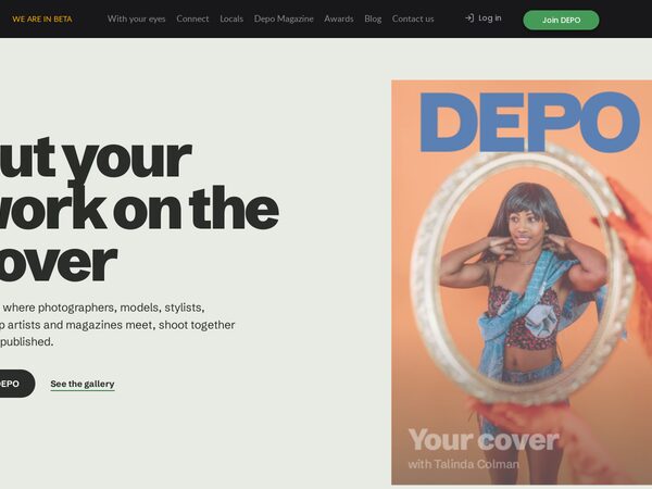
The owner's favourite and the bar for every later demo. A light, editorial DEPO: a magazine cover with the DEPO masthead stays pinned while the text scrolls, and each of the six values becomes the cover line of a new issue with a community portrait as its star.

Read the post Open the demo

–/10 0 comments

Straight from the Covers

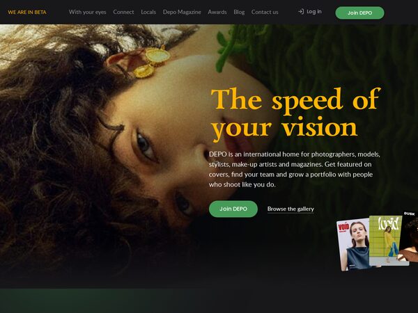
The improved original in the DEPO brand (dark, gold Lazurski, green action), every block reworked: headline beside the banner photo with fanned covers, a cover wall filtered by magazine, values under a sticky title, a role switcher, a cover band and staggered faces.

Read the post Open the demo

–/10 0 comments

Future Studio

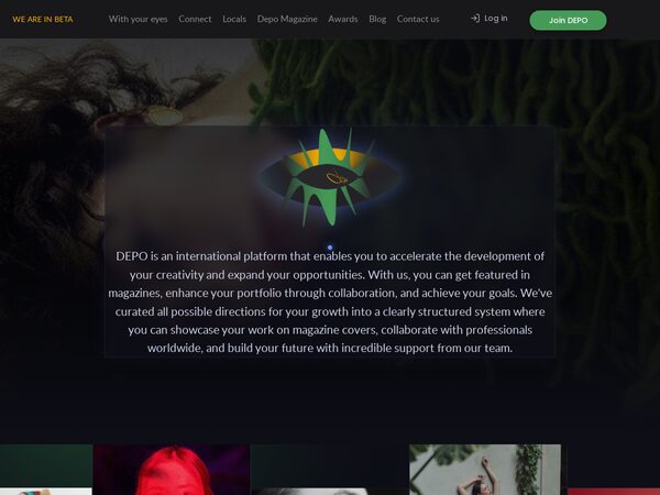
Speed of Your Vision (demo2) re-skinned as a restrained "future studio": deep graphite ground, indigo and violet glow, frosted-glass panels, monospace captions, a thin gradient progress bar and a custom glowing cursor that opens into a ring over links.

Read the post Open the demo