Four Frames
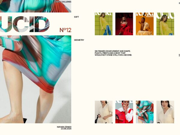
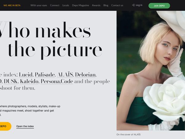
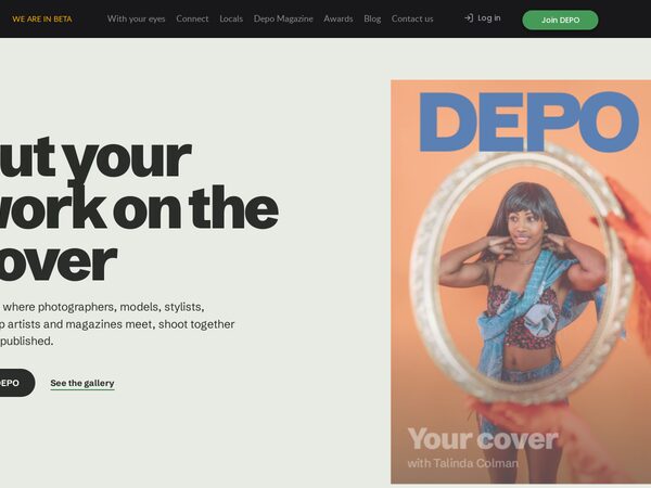
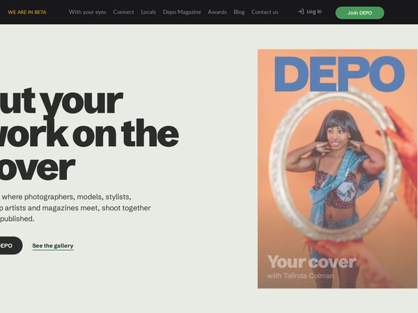
What DEPO does, told by one series: a person as they are, then make-up, then hair, then the magazine cover. The same four frames in four versions: aperture blades, a shutter you press, turning slats, and prints that land on a pile.
Every page we tried for DEPO, one post each: what it is, how it was built, how it looks.
53 demos
Pages that read like a printed issue: serif display type, pinned covers, page turns.
What DEPO does, told by one series: a person as they are, then make-up, then hair, then the magazine cover. The same four frames in four versions: aperture blades, a shutter you press, turning slats, and prints that land on a pile.
Five DEPO galleries as photo compositions that morph into each other — cards travel, new pictures wipe in diagonally, text rises line by line out of masks. The large card opens its gallery as a magazine issue: cover, contents, feature, spreads, quote, interview, next issue.
The hero is an open DEPO issue on a deep green ground. Its 18 pages turn in 3D by click, drag, swipe, arrow keys or the contents page, and the first pages turn by themselves as you start scrolling. Below it, faces in parallax columns, a role chooser and the closing call.
DEPO set like a luxury publisher's index. Huge Didone lists of magazines, people and roles on a cool grey ground, real covers trailing the cursor, a hovered row's picture following the pointer, and one pinned deep green chapter for the values.
The home page read like an issue of DEPO. A pinned stage turns vertical scroll into sideways page turns through full-width spreads (cover, contents, six value features, credits, magazines, back cover), with photo and type parting in depth and a bar that opens the contents.
The Cover (demo5) with one change: once the site header has scrolled away, moving the pointer up towards the top of the screen pulls it back down bit by bit, and it locks in place near the top. Drop the pointer and it slides away.
The owner's favourite and the bar for every later demo. A light, editorial DEPO: a magazine cover with the DEPO masthead stays pinned while the text scrolls, and each of the six values becomes the cover line of a new issue with a community portrait as its star.
The improved original in the DEPO brand (dark, gold Lazurski, green action), every block reworked: headline beside the banner photo with fanned covers, a cover wall filtered by magazine, values under a sticky title, a role switcher, a cover band and staggered faces.