DEPO Demo album

Every page we tried for DEPO, one post each: what it is, how it was built, how it looks.

53 demos

Connect

The Connect page — partner and free magazines, people — laid out ten ways: vertical grids and stacks, and rows that scroll sideways under the mouse wheel.

6–10 of 14

Per page 5 10 20 50

–/10 0 comments

Connect · Wide Screens

The DEPO Connect page as cinema screens — a letterboxed banner, partners as 16:10 crops with the magazine name set huge across each card, wide FREE cards and a two-row People rail; the wheel scrolls the row under the cursor and the centred card is brighter.


Read the post Open the demo

–/10 0 comments

Connect · One Rail

The cleanest, product version of the DEPO Connect page and the reference rail engine — every section is one row (3:4 partner covers, smaller FREE cards, portraits); the wheel scrolls the row under the cursor, with quiet glass edge zones and a thin "03–06 / 56" progress line inside each row.

Read the post Open the demo

–/10 0 comments

Connect · Newsstand

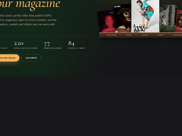
The Connect page as a premium kiosk at dusk: one lamp-lit walnut shelf per partner magazine with its issues fanned on it and leaning toward the cursor, free titles on an open rack, people as paper contact cards. All wrapping grids, no sideways scrolling.

Read the post Open the demo